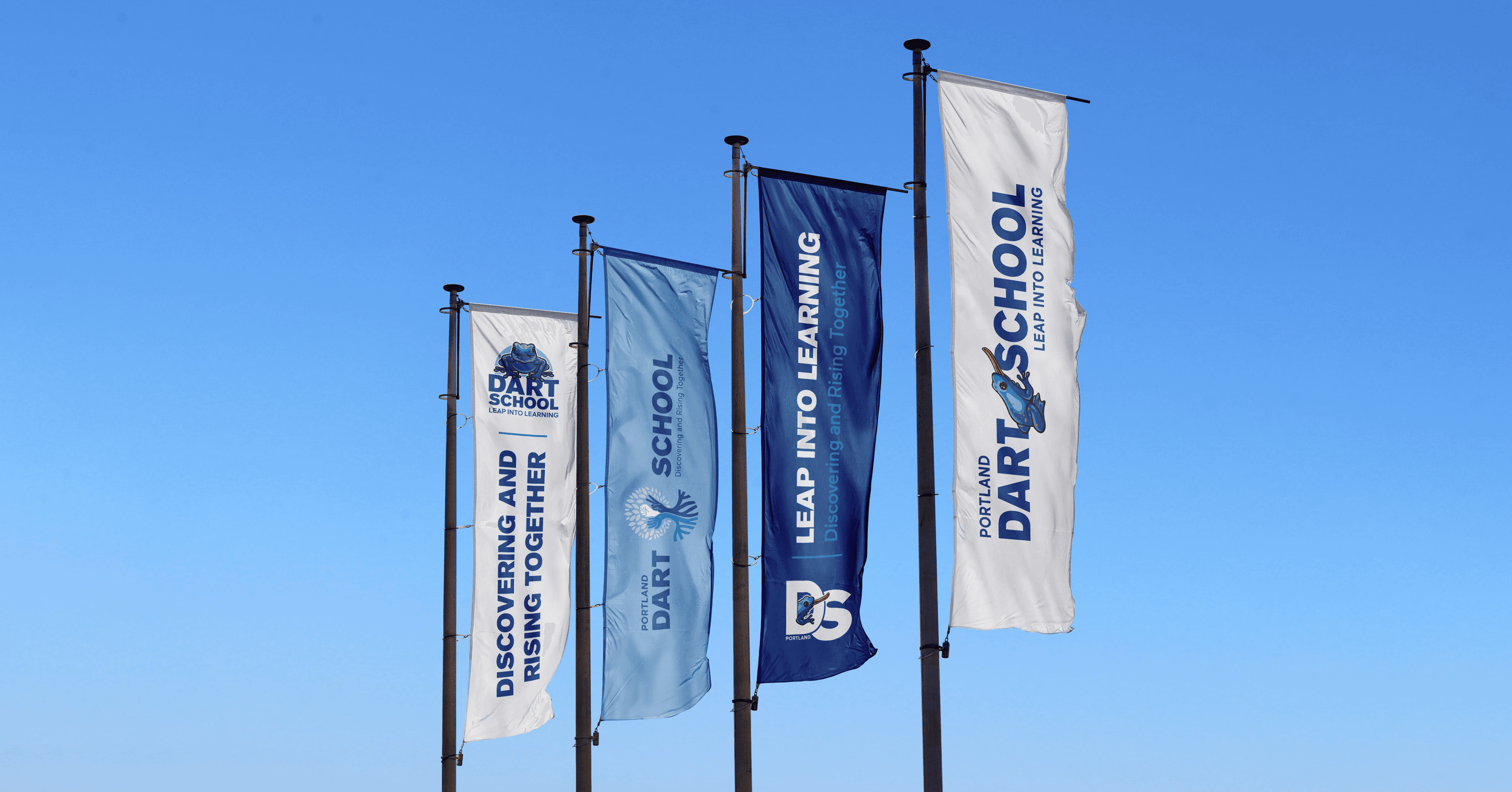
We took the original, visually complex design and gave it a modern, streamlined look, maintaining the iconic tree with its branches, roots, and leaves. By introducing overlapping circles, we brought structure and balance, creating a cleaner yet familiar aesthetic. The color palette was refreshed with "Sky Blue" and "Golden Yellow," paired with a pale blue to add subtlety and cohesion. The result? A harmonious blend of past and present.
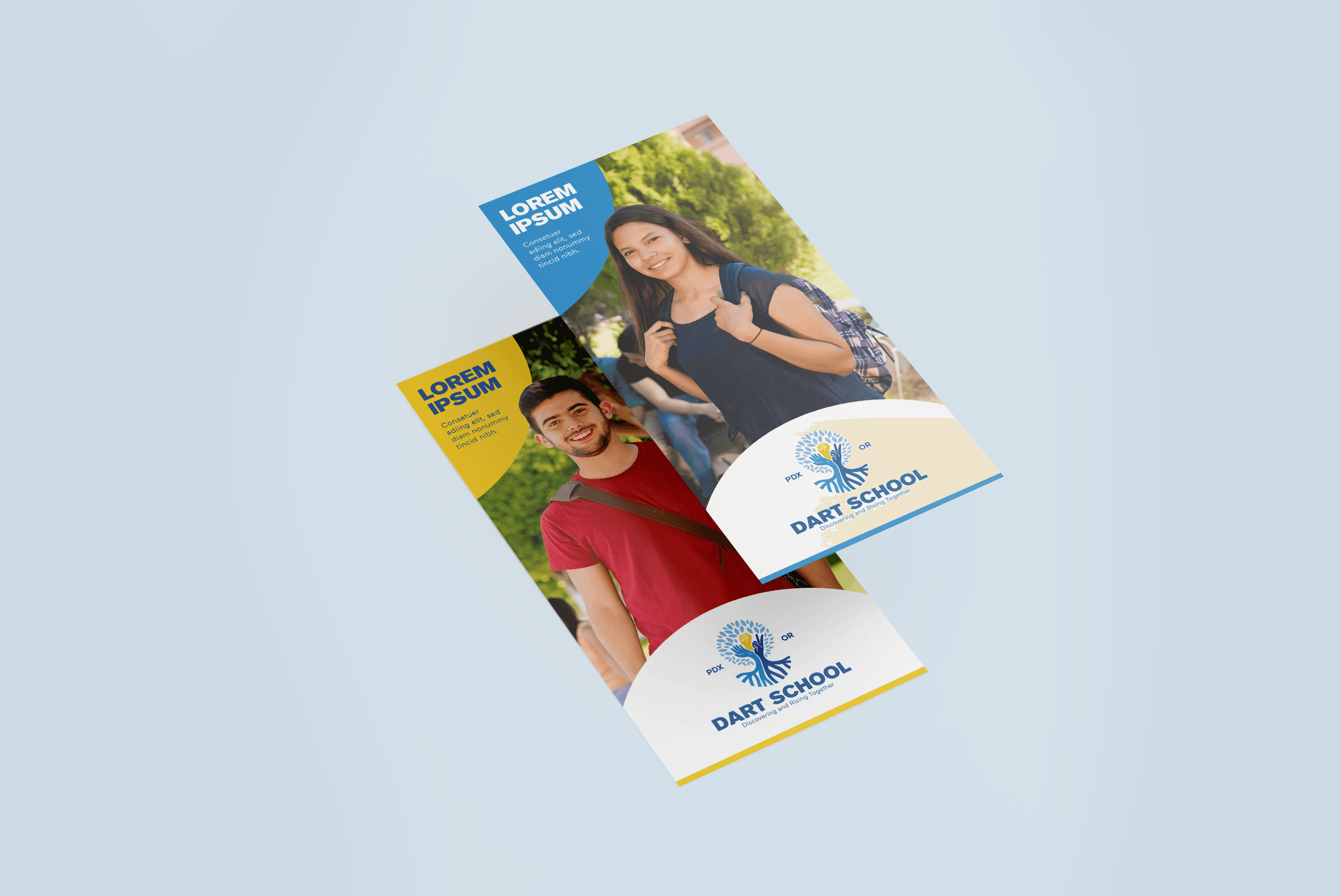
For maximum impact, we chose a bold sans-serif font for titles and paired it with a refined, secondary typeface for body text. The winning frog mascot from the student competition was reimagined and adapted into two flexible versions, allowing it to seamlessly fit into the updated logo across various platforms. The new brand identity reflects Dart School’s values of inclusivity, growth, and joy while embracing a fresh, unified design.
Beyond just a logo revamp, we developed a flexible system of logos that works across digital and print formats, ensuring Dart School’s visual identity stays strong no matter the medium. This adaptable approach keeps the brand’s integrity intact while remaining versatile for the school’s future needs. In the end, this project was more than a refresh—it was about elevating Dart School’s brand into something that reflects their spirit of growth, resilience, and unity. Together, we didn’t just update a logo, we helped them leap into the future with a brand identity that’s ready to inspire the next generation.